
What to Wear
A simple style guide for your family, maternity, or newborn session.
First, take a breath: you can't fail this. When an outfit misses, the photo still works. At most it pulls a little attention away from the feel of the moment. That's the whole risk. So use this page to make things easier, not to stress over.
Three Simple Rules
When people ask me what to wear, this is what I say.
Two or three colors, total
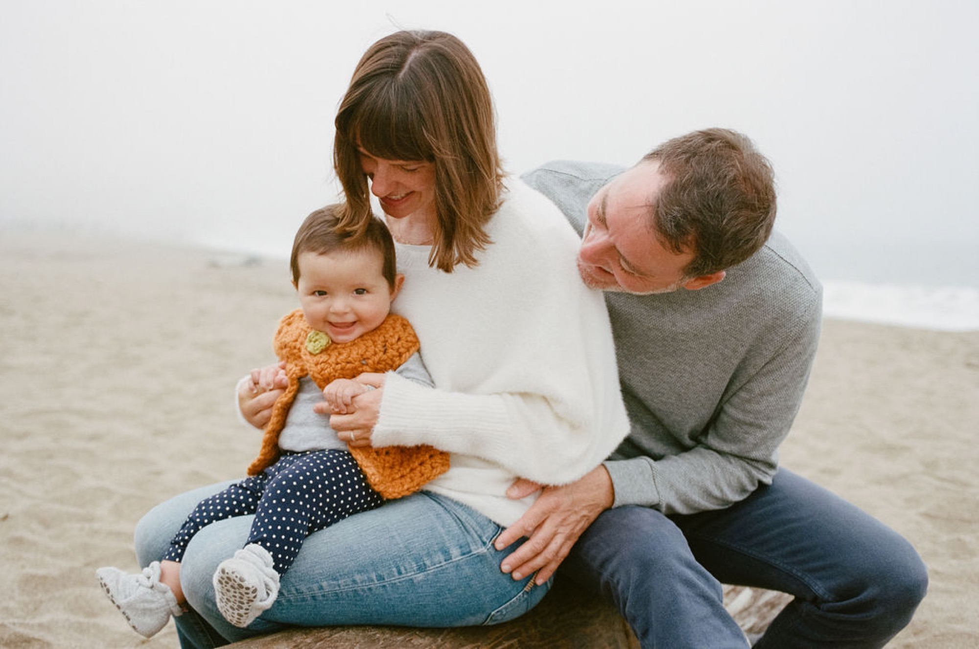
A base color plus one or two more, for the whole family. One of them can be your loud one. Keep it in the same palette, just more saturated, and let it stay small and land on one person: a knit on the baby, a ribbon, one jacket.
Keep them in one brightness
This is the one that does the work. Not one color, one level: all light (cream, oat, sand), all mid (grey, denim, camel), or all deep (charcoal, coffee, olive). Squint at everyone together, and if one person jumps out darker or lighter than the rest, that's the piece to swap.
Neutrals are the easy win
Tan, ivory, oat, sand, grey. Faded denim counts, and it's the answer for everyone's bottom half. This is also the one decision you can make before you know anything about the location.
Then one last check, against the place: would you come across this color on a walk there? If you would, it belongs.
And when you're not sure, send me a photo. You'll have my number once you book, so text anytime. I love giving feedback on this, and it takes me one look.
The One Rule That Does Most of the Work
Let the location set the palette. Before you plan anything, look at a photo of where we're shooting and notice two things: how bright it is, and how much color it has. Then dress inside that.
Beach? Think sand and seashells. Redwood grove? Jewel tones and deep color. The coastal trails at Land's End? Muted earth tones. If you'd come across the color naturally on a walk through that place, it will work.
Stay in One Range Together
The other half of it is brightness. A family reads best when everyone sits in a similar range, and when that range relates to the setting on purpose.
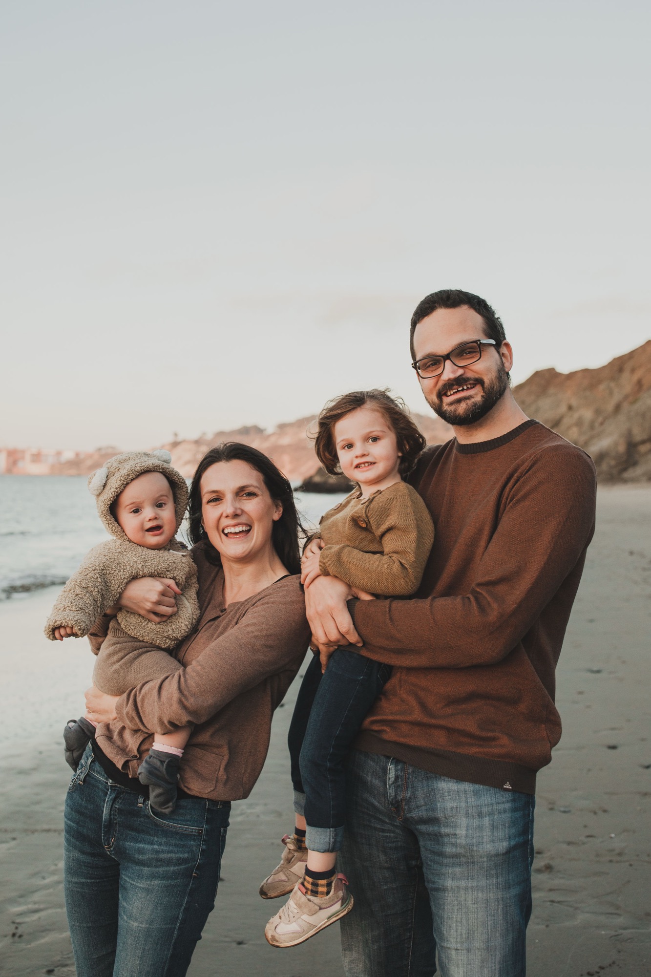
There are two ways that goes well. Everyone in about the same brightness as the place, so the color feels woven into it. Or everyone a step deeper together, so you read as one shape against a pale background. A family in shades of brown on pale sand works for the second reason.
What pulls a photo apart is a mix: one person in something much darker than everything around them while everyone else is light. That dark piece becomes the loudest thing in the frame, and attention goes there instead of to your faces. A deep green sweater and black tights in a golden field is the classic version.
So pick your one or two base colors, then check them against the setting before you check them against each other.
Matching Is Allowed
One of my favorite sessions ever was at China Beach in San Francisco. Fog, wind, moody light. The whole family wore shades of brown, from deep coffee to caramel to sand. It fit the beach perfectly, and we all loved how the gallery felt.
So if your family wants to dress in shades of one color, do it. A palette that repeats is calm, not boring.
Texture Over Pattern
Texture photographs like magic. Chunky knits, linen, lace, corduroy, a long skirt that moves in the wind. When you're choosing between a print and a texture, pick the texture.
Small patterns are fine, like tiny dots or a faded floral. The things worth skipping: big logos, graphics, and neon. They pull the eye away from the people wearing them.
Dress for Where We're Shooting
Beach session? Dress beachy. Trail with a view? Dress like a beautiful hike. Newborn session at home? Cozy is the whole point.
The test is simple: picture yourself in the outfit, at the location, doing the things we'll do. If it feels good when you imagine it, go for it.
The Printable Style Guide
Stylist Vanessa Mari put together a Style Guide 101 for Marin Mini Sessions families. Shop your closet, style everyone around one piece you love, and the basic rules for what photographs well.
PDF, 5 pages.
Want to Go Deeper?
A few guides from the blog: